Wednesday 24 October 2012

Jake Wyatt - Metro


A gorgeous animation I found which feeds my love of music and picture without any dialogue (like Ryan Woodward's - Thought of You).
 It's quite minimalistic so very easy to watch.


Here's the link to his blog which has loads of his illustrations and comic book pages on it as well as Metro.

I like the panelling of this page (below) because of how some of the picture break out of the panels. I also admire the attention to detail in each drawing especially since there are no speech bubbles as the action here still flows really well:


I am addicted to these matt colour palettes. His drawings range from simplified silhouettes to dynamic long shots of full bodied characters.


And now I want orange tights.

Bauhaus

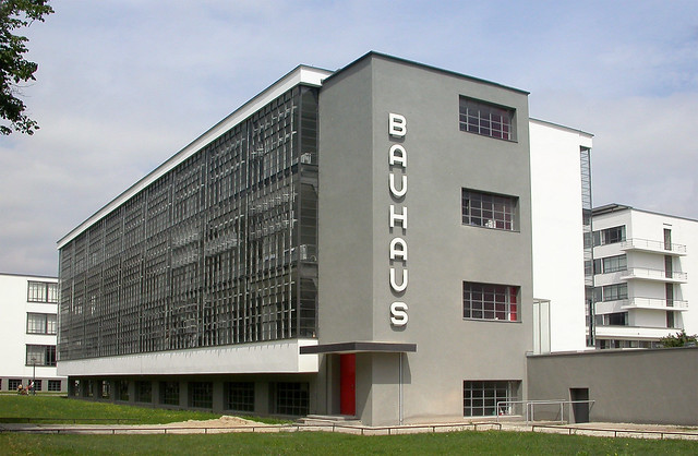
The Bauhaus was one of the most influential modern art schools of the twentieth century whose ideology regarding the relationship between art and society has impacted on the western world long after the school itself closed.

Bauhaus stressed the importance of uniting art and industrial manufacturing and spanned furniture to architecture.


The school of Bauhaus was found by Walter Gropius, who once said something like this:

"...we want an architecture adapted to our world of machines, radios and fast cars."


So they designed these big-blocky-type buildings.

"The Engel House in the White City of Tel Aviv: architect: Ze'ev Rechter, 1933; a residential building that has become one of the symbols of Modernist architecture"
                                                                                         -Lazy Wikipedia quote

And this is an architectural design by another influential Bauhaus architect, Hannes Meyer:

I can't say I'm too hot on this and it feels strange to say it but, 
                               these designs, that were once considered to be pioneering and 
                                                                                                               emblematic of the vision of modernism, 
                                                                                                                                                          just look a bit old fashioned to me.


If we shadows have offended
Think but this, and all is mended

Life Drawing (Attempt 1)

Seeing as I'm a complete failure at anything pertaining to the word 'organisation' and post things onto my blog spasmodically and sporadically, here are a few of my drawings from the first life drawing session which was over a month ago now.
And to top it off, the pictures are really bad quality.

Anyway...

 These were ten minute sketches and we were only allowed to use straight lines.


 I really liked structuring the face on this one:
 And then a final example from that week from a more interesting perspective. I thing I had about thirty minutes for this one:

Tuesday 23 October 2012

Illustration - Laura Carlin


As a little introduction to our illustration week, we've been asked to pick a single image by an illustrator off a list we were given.

The artist I chose is called Laura Carlin. She works primarily in her sketchbooks, mostly drawing and painting.
This image of hers caught my eye for a few reasons, namely because it is a 3D piece whereas her other illustrations are in 2D.
I am always very taken with paper sculpture and how paper retains it's two dimensions even in a sculpture. 
What I like most about things like this are the layers and shadows that are created. 

This piece reminds of book sculptures by artists such as Brian Dettmer and, in particular, Su Blackwell who often puts small LED lights into her cut out fairytale scenes, as shown below:
Two very different pieces using the same media: paper. However  Carlin's illustrative background shines through in her use of colour and drawn aspects to her paper sculpture, whereas Blackwell focuses on shape and shadows.

Friday 12 October 2012

Dale Chihuly

An American glass worker I discovered during the applied arts week:

Dale Chihuly, born in 1941 in Tacoma, Washington studied interior design at the University of Washington. He was introduced to glass as a student but discovered the team approach to glass blowing, on which his work depends today, when working in a glass factory in Venini, Venice.

I really admire this sort of work as it is a very old and skilled art to master yet simultaneously modern and exciting.
I'm also just a simpleton that is drawn to rainbow colours.
As well as the bright colours, I also think that Chihuly has explored the transparency of glass, how light passes through it and how this creates less tangible though as equally stunning shapes and colours.

I am drawn to alien things, coral reefs and those mysterious creatures from the bottom of the sea. With light and colour you can create a world, a habitat for something else and I like the enigma of an unknown form in an unknown space.


"I love to be around water. There is no doubt in my mind that water is conducive to thought. Water allows me to be incredibly creative. The connections between glass and water are so unbelievable and so visual. I work with four materials, of any scale—glass, plastic, water, and ice. And it is really light that makes those materials come alive." 
Chihuly

This is a glass sculpture in an aquarium, in bringing his fascination with glass and water together, it becomes so obvious that these forms, that look so alien and out of place on the surface, belong underwater.
And here are a few others that I really like:
 I saw this one (above) in the entrance of the V&A in person before I had even heard of Chiluly and it stuck stubbornly in my mind.

Just like seeing a real alien probably would.

Wednesday 10 October 2012

Fashion Design Week

The week of fashion we did revolved almost entirely on shape.


We were given templates for generic shirts and trousers and then drew around them in different ways to create new shapes. The focus wasn't really on designing things to wear that were practical but on creating a shape that caught your eye. 


We cut, folded and pleated our shapes until we were happy. Here's how mine turned out:
The thing that struck me most was the idea that things look better when they aren't too complicated. Too much detailing is a bad thing, less is more and all that.


Nextly
(and I realise that is not a real word)

We took our shapes and tried them out on child size mannequins. I put a few extra darts into my shapes and created new shapes that worked very well, namely the big curly thing at the front and the over-the-shoulder erect collar type thing. 
Very technical stuff.

Following those little experiments, I started to assemble a larger version of my shapes onto a full size mannequin whom I named Kate.
Above and below are an 'in-progress' shots of Kate the mannequin with just the over-the-shoulder collar/wing and the curled tube thing. I thought that the contrast between the simplicity of the 'wing' sweeping backwards and the little section of detail coming down the centre sort of encapsulated what I had discovered with the flat shapes earlier: 

Detail works only in a sea of simplicity.


And so I went on in my fabulously contradictory way to create something horribly over detailed and totally lacking in any big simply, striking shapes.


But I must admit, I liked the back of it.
And that is because my chaotic brain allowed me to retain some areas of calm. 


So lesson learned I hope.


After designing through making, I began to refine my ideas in drawings considering the importance of fashion illustration.
Close-up observational drawings from my model:


Tracing paper became invaluable. I'd draw my garment very roughly in black fine liner, then trace it more neatly, correcting mistakes. Once I was happy with that, I'd trace it again in biro.
Front:
 Back:

From there I started designing new garments using parts of my 3D piece and rotating them, changing the size of them of the shape itself. 

I began adding in figures to add to the character of my designs. This design took on a very striking and futuristic appearance with the overall diagonal shape to it (which I gradually developed) and the severe modern bob hair cut on the model.

In contrast, this has a funky tribal thing going on because on the huge afro, stripe motif and big beaded necklace (though it's not a necklace, it'd be part of the garment.)
This was my favourite of my micro-collection, because it's kind of silly but not ugly. Just about wearable but definitely not conventional. 
Fun, I think the word is.


Textiles Week

A selection of the work I produced in the textiles 'taster' week.
We did a lot of drawing exercises that were supposed to make us consider shape and line over accuracy and realism. In the textiles room we worked at easels making drawings based on two large tables full of random objects. 

We were emphatically warned away from the deadly 'sketchy line'.

So,  I drew the following two pictures using my right hand (I am left handed) and without looking at the paper. It's also two drawings on top of each other (if you were to flip you're entire computer upside down, you might be able to make out a horribly shaky outline of a sheep skull. It probably isn't worth doing Completely worthwhile).
 Close-up:
I used a graphite stick and started to draw using my whole arm instead of just my wrist which made the lines much more dynamic. I also discovered the magical world of varying line weight.

From those pictures (specifically from the close-up), I made a couple of mono prints:


 This first one focusses on line and basically trying not to make it look horrible and experimenting with the technique. 

This second one I tried layering two colours (orange and blue because they're fairly complimentary) and I also used some handmade stencils, i.e simply placing little pieces of paper onto of the print. 
I really did like how the lines were so crisp and neat and thee was something fun about almost working blind. BUT, as logic usually fails me, I did really struggle with the planning aspect of mono printing - you've really got to go into it with an intention and a method. 

Just to clarify, intention and method are two things I usually lack in experimental work.
Moving on.

For the following we were encouraged to make a ground for the work, and after ann initial five minutes of drawing with ink and sticks and in all manner strange ways, we were asked to then work into them 


This is one of my favourites, drawing just a single object multiple times, in multiple ways, in different media and in different orientations whilst keeping an eye on composition and colour. I rotated my drawing 180 degrees each time i drew it and the end result was a picture with a very busy centre but a strong overall shape.

 In the close-up the quality of the lines and the contrast between the different media make it quite striking.

And finally, moving on to the final piece(ish) of the week. I took a shine to this particular continuous line drawing of a starfish, liking the shapes and composition - the way it divides the page horizontally into four sections (or at least it does for me). 
I also liked it because it wasn't too busy, whereas most of my other drawing shad been. 

And from that, I drew together everything I had learned.
 I realised that if I don't like a piece of work I've done, it isn't finished yet. I really persevered with this one, completely restarting sections again if they didn't look right. 

And the pile of work at the end of it all...