Monday 10 December 2012

'Found'

Looking at found imagery in illustration (now that I've specciiialllised) and I've had totally mixed feelings about this project... though there have been some good looking outcomes. 

I'm struggling with the idea of working to a brief as it feels a bit restrictive.
Anyway this is the work I've made so far that I'm happy to share. Some of it I don't like, for example, this next one:
But it was fun to make and sparked a few interesting conversations. 

Then I was given this quote from a magazine:
"The all hunched over our phones, addicted to the buzz of twitters ticker tape"
And had to make some images based on that.


 My desk at the time:

 I like the words "restless image" and "the illuminated" because although one might think they suggest hallucinations or enlightenment, I'm making them refer to peoples faces illuminated by flickering computer screens.

The is my favourite one, but frustratingly I've lost it!
 The faceless person refers to the anonymity of people on the internet. I thought the lights in the background looked like little streams of information. 'The Artful City" and the quote about being a writer reflects on how being a writer or an artist is not so extraordinary on the internet.

Sunday 11 November 2012

Fine Art

I ought to stick this stuff up here as I did really enjoy fine art, although it feels like a decade ago since I did it...

We mostly used the projectors to draw the outlines of objects.


It really was just playtime.

But with a bit of thought thrown in there too. 
If I don't like something, then it isn't finished yet...


Being left to my own devices was my favourite part of this week.


3D Design - The Death Vine

In the 3d design week we went through a lot of observational drawing and technical drawing. 
On the first day we learnt about one and two point perspective.
So we drew trains: 
I didn't like my drawing. I wasn't allowed a ruler, I had to draw in pen, and wasn't allowed to start again. But I hadn't done one/two point perspective in ages and the drawing did refresh my memory somewhat. 
The 3D technician went a bit weird about putting in a 'background', i.e a square. He liked my square, and I still don't really know why.

When I got home, I drew another train in my sketchbook, just to reassure myself that I can draw a bit better than the days earlier attempt. I didn't use a ruler but I did use a pencil and rubber. Things got  lot more complicated on the small scale A4 sketch book:

The following task of 3D was to fight over a box of objects until we got one we liked, then draw it quite accurately from all it's different angles. I don't have a clue what my object was exactly, some kind of gyroscope, but that didn't matter - we had to make a sheet that described the object, and I think mine turned out quite well:

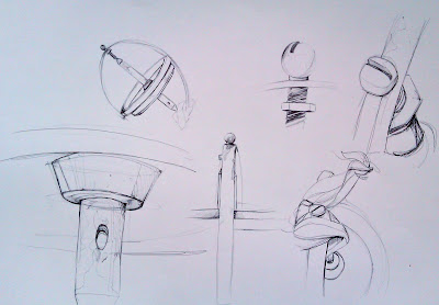
A couple of close-ups:

 Drawing in Biro was difficult but it made me draw more slowly (so as to not make a mistake) and ergo more neatly and carefully. I also like the tonal range a Biro had to offer.


 After that, we were given ink and little pieces of cardboard as brushes and continued to draw more of our object. It started off well (the left side of the drawing below), but I started to revert to my usual messy, impatient way of drawing. 
 These two drawings aren't bad, as whole pieces - they are quite striking. But I lost the accuracy. 
We were supposed to be looking at new ways of representing our objects with the piece of cardboard as a brush, and I think I ended up with quite a nice balance of light and dark in the end.

----------------------------------------------------------------------------------------------------------------------------------

On the second and third day of 3D, we moved into some, well, 3D work.
It was very similar to the fashion design project we did where we had to focus on shapes. 

I like organic shapes and curves. So I made this little guy. 

After we'd done the practice pieces, we got into groups to make something larger. Emphasis on 'something', it didn't have to have a function as of yet, it just had to be nicely designed.

Unfortunately, my group didn't like organic shapes and curves - they liked things being symmetrical and neat.
Our group thought it'd be a good idea to make origami petals:

Then them into flowers:
 We spent a loooong time toying with a 'lamp' design:
 I didn't think it was very striking, but it was quite interesting because we had to weight it in a funny way to make it stand up even when it looked like it would never stand.
I would not buy this lamp.

 The group eventually created something organic. A much larger, simpler version of the flower petals were made and stapled together along with long, thin strips flowing down from it, all made out of flexible plastic. 
The smaller flower on top of this black death vine creation it made out of quite a stiff cardboard and was almost as hard to make as the plastic one, but it does look a lot better than the flimsy paper ones we made. 
The teachers were oddly impressed by this. 
Either way, I had fun in the 3D week, even if I'm not very good at it.

Friday 9 November 2012

Light Weight

Studio work from the third and final day of photography.
I made a video of the photo's we took but it doesn't really do them justice.

So, I'm uploading them separately.
The third day of photography was very fun and creative and the group worked together really well to create some great images in the studio.

We took this picture with a very long exposure and in darkness. Every so often, we had a huge split second flash illuminate the scene before going back into darkness. Between each flash everybody moved so that a different image was illuminated each time. This meant we had lots of different pictures all being recorded in the space of one photo.

This is a second attempt where we stayed in the same positions for a few flashes to make some figures more solid, then just do a single pose for one of the flashes for a more ghostly effect:

The next three images are light drawings using torches. The group split into two teams where one team was put into a pose and the other team had to draw around them from behind with torches. In the long exposure time of the camera and in the blackness of the room, the light trails were the only things captured in the pictures
That one looks really cheesy 

The next one worked out really well:
The idea is pretty standard (the evolution of man), but instead of drawing with the torches, we scribbled. In this photo I was posing second from the left. I had realised by this time that to get a good image, I had to create as much shape as I could with my arms and legs in order to make a clear silhouette.

This next one created an interesting effect
This next one is a mega fail.
I was drawing my partner with my torch but they were standing on the other side of the room. I had to use the air as a sort of canvas. I hope my partner wasn't insulted when she saw the drawing.

This is the same thing again, except there were six of us drawing. I prefer this one to he last as the drawings make a set as opposed to just a single squiggly fail.

----------------------------------------------------------------------------------------------------------------------------------
The final thing we did in photography lent towards fine art. We were told to create a composition of the figure (in pairs) but had to cover the face and as much as the body as possible.

This is how my partner, Jane, dressed me:
When Jane was told she had to cover up my body and face she thought of bereavement and mourning. So she sat me in a chair, and draped the black across my face. To avoid an all black cliche, she drowned the rest of the composition in this scarlet material. The pebbles were difficult to hold. 
I've tweaked the image in Photoshop to enhance the shadows in the fabric.

And here is how I dressed Jane:
We were told to cover most of the body which instantly made me think of being oppressed and restricted, so I wrapped Jane entirely in this black splattered sheet and black shroud over her head and shoulders. I made her hold the jug which is is angled to look like its 'pouring' out the fabric that is covering her. The thing through her neck looks like a massive bolt.
(No Jane's were harmed in the hanging of the big bolt-like thing)

Close-up:
 This was my favourite part of photography as it involved communicating an idea as opposed to just playing with the camera. I think my composition was successful because it is simple black and white, with only two areas of detail: the jug and the bolt.

OVERALL 
I didn't think I'd enjoy photography as much as I did and I really did learn a lot about taking pictures, composition, colour and the techi-stuff in the dark rooms.

"Walk About" Photography

On the second day of photography we went into town to take some observational photos. I tried to look for things that were quite quirky or out of place.
 It was market day in the town and my pictures tried to describe the grey day and hodge-podge of colour, people and smells around the stalls. I also wanted to show the people and place in a natural way, with all its beautiful decay and mess laced in with the bustle of those who live here.
I found it difficult at first to take pictures of people without feeling intrusive and also found that once people became aware of being photographed, they moved or posed for the camera.


Wednesday 7 November 2012

Graphics Design

The outcomes of the graphic design week.
And during the graphics week I found I have an interest in typography - yay, personal discovery.

I made  few designs for the words:
DETACHED
RAPID
CONSUME
and I should have done flowing too but I'm slow
We were told to be very abstract with our designs, so as to make the viewer do some work when looking at it - people get bored looking at things that are easy to look at. Above if my interpretation of 'consume'. I was going for a black hole effect of things being sucked in. Other people interpreted 'consume' as eating and shopping.

I scanned the image into Photoshop and created this:

I duplicated the image, flipped it and used the 'subtraction' setting on the upper layer (I think)
The whole thing has a lot of movement, even the letters are being sucked in which I quite like. I think the overriding black is very important in the idea of consuming.

This is my design for rapid. I chose metallic colours as a reflection on how technology is developing so quickly. Everything has a direction, left to right, to indicate speed, and the chequered patches are like racing flags.
I photocopied the image in red and added the black stripes which I decided were a strong colour combination to represent this word.
In Photoshop, I added the filter 'posterize' to simplify it and made the overall colour scheme red - as it's an aggressive colour. I applied a motion blur to cash in on the expected cliche of something moving across the page. I think the blur works well because it sets these striking shapes into motion.

These are all hand made designs for 'detached'.
I began with the idea of the letters having to work around the jagged shapes.

Then I moved on to putting the words behind the shapes, so as to  break them up.


This one is my favourite because it is much simpler, the word is striking and central and the background, as opposed to playing a key part in the image, supports the idea the word portrays.

I enjoyed graphics design a lot more than I though I would. 
The processes of developing ideas are much more methodical than the creative insanity that I usually function with, so it was refreshing to be challenged into injecting creativity into quite a restricted way of working.

I also like typography and discovered an interest in 'kinetic typography', (basically animated words). An example of this is this video by Ronnie Bruce, of a slam poem by Taylor Mali, an American poet/writer. (As an English literature geek, I also enjoy the poem):


OVER AND OUT